Main menu
You are here
September 2010
themeing validation errors for checkboxes in drupal
4 September 2010 - 2:31pm — drewI came across a problem when working on a Drupal user registration form which had to include an accept terms and conditions checkbox. In fact, I came across a couple of problems, but I only had to fix one myself.
At present there are some bugs in Drupal 6 core pertaining to mandatory checkboxes. Luckily, there's a module for that. I was using the handy terms of use module, which works around the mandatory checkbox problems with or without the help of the checkbox_validate module.
One problem remained though - if I submitted the registration form without ticking the mandatory terms of use checkbox, the form validation worked in that it stopped me proceeding, and I saw the You must agree with the Terms of Use to get an account error message at the top of the form, but there was no visual highlighting of the checkbox in question.
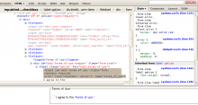
A poke around with firebug confirmed that the form API has been cajoled into doing its form_set_error thing, and the checkbox had the error class. However, styling form elements - particularly the different types of inputs - with CSS has always been a bit hit-and-miss. The 2px solid red border that the stylesheets specified should be around the checkbox was nowhere to be seen.
I checked in several other browsers (lots of screenshots included with this post) - it looked like the IEs and Opera were the only browsers which rendered the red border around the checkbox - Firefox, Chrome and Safari did not.
My workaround is to override the theme function for a checkbox, and to wrap checkboxes with the 'error' class in a span which I can then style. In my CSS I also turn off the red border for the checkbox itself, as otherwise you get double borders in the browsers which don't have this problem in the first place:
<?php
function mytheme_checkbox($element) {
  _form_set_class($element, array('form-checkbox'));
  $checkbox = '<input ';
  $checkbox .= 'type="checkbox" ';
  $checkbox .= 'name="'. $element['#name'] .'" ';
  $checkbox .= 'id="'. $element['#id'] .'" ' ;
  $checkbox .= 'value="'. $element['#return_value'] .'" ';
  $checkbox .= $element['#value'] ? ' checked="checked" ' : ' ';
  $checkbox .= drupal_attributes($element['#attributes']) .' />';

  if (strpos($element['#attributes']['class'], 'error') !== false) {
    $checkbox = "<span class='checkbox-error'>$checkbox</span>";
  }

  if (!is_null($element['#title'])) {
    $checkbox = '<label class="option" for="'. $element['#id'] .'">'. $checkbox .' '. $element['#title'] .'</label>';
  }

  unset($element['#title']);
  return theme('form_element', $element, $checkbox);
}
...and...
[[css]]
/* CSS */
.checkbox-error {
border: 2px solid red;
}
.form-item .checkbox-error input.error {
border: none;
}
[[/css]]
The results are not visually perfect - the red border on my span doesn't always hug the edges of the checkbox very neatly - particularly in the browsers which don't render the red border around the checkbox, as they tend to be the ones which are rendering shadows or other fancy effects. Anyway the point is there's now something you can hang your hat on CSS-wise, and that actually shows up in all the major browsers.
- Log in to post comments


